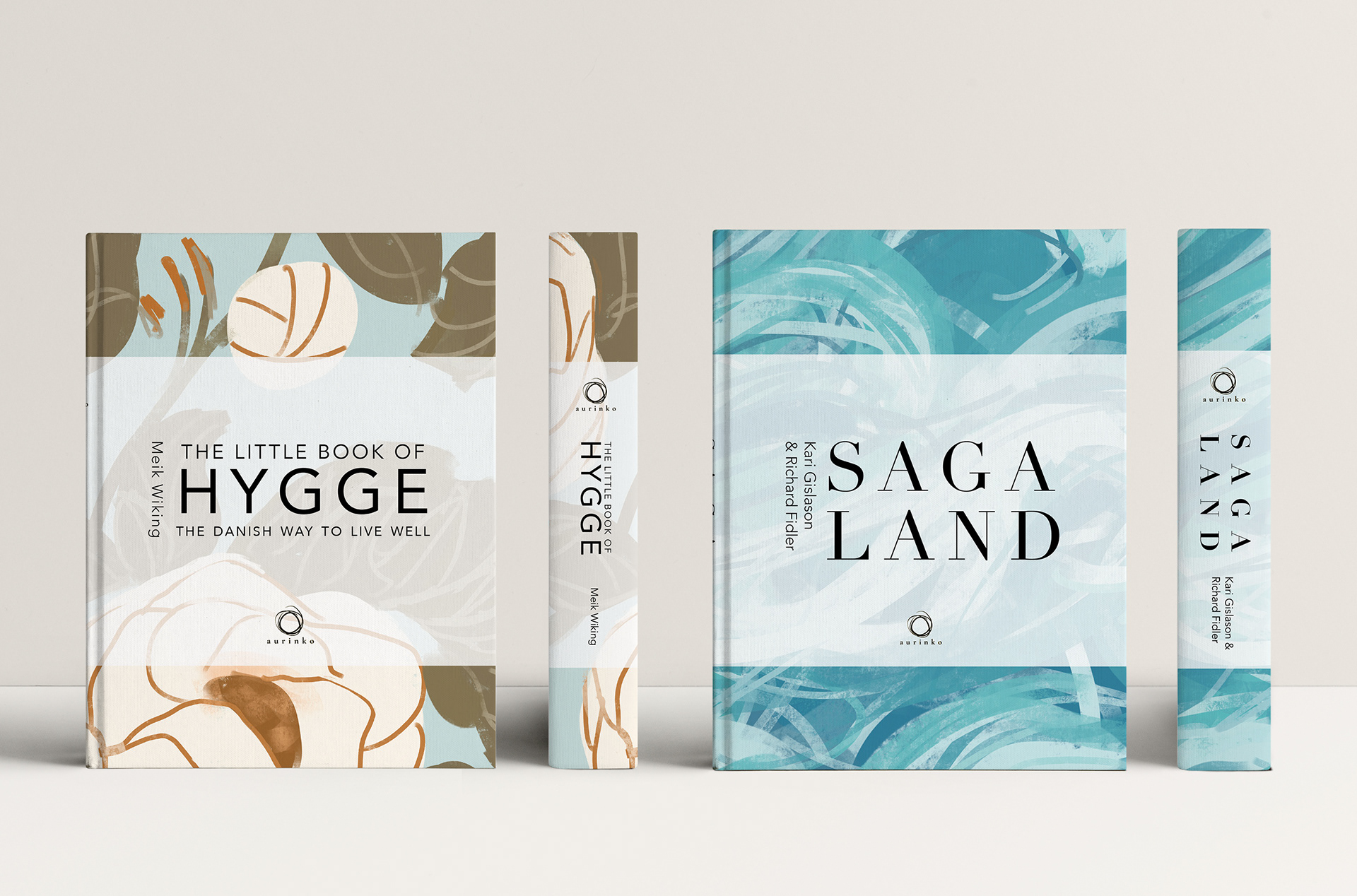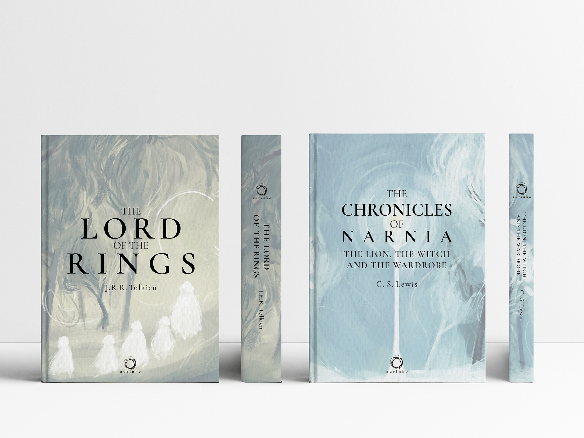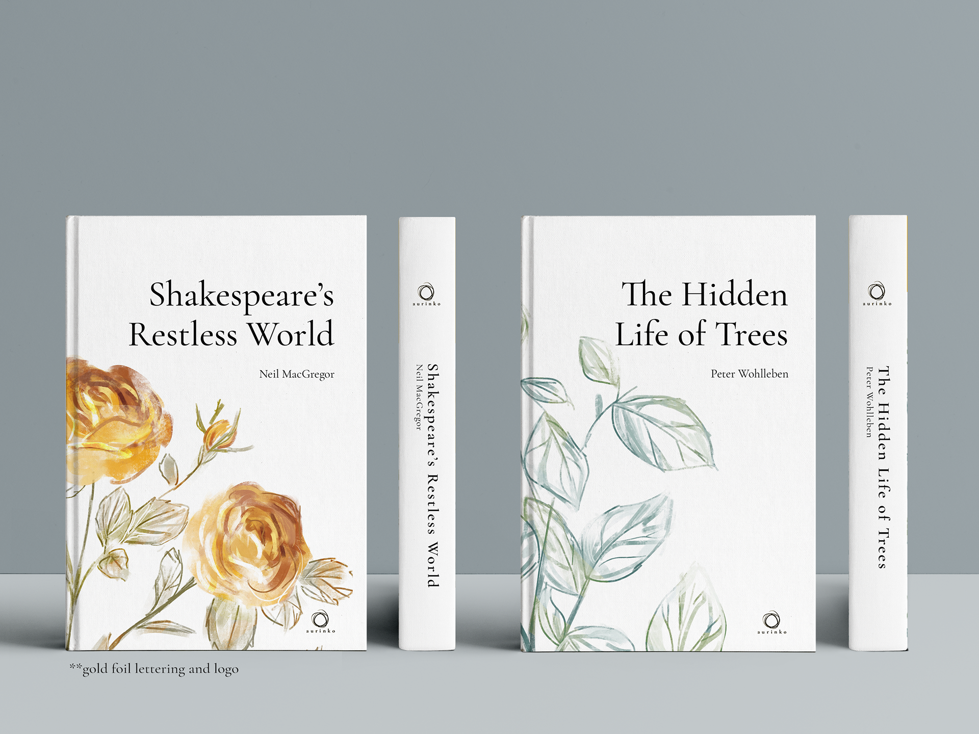
Visual identity and book design for a fictitious publisher. Aurinko Publishing House is a company targeted at families and academic readers of all ages. It is dedicated to creating special editions of some of the world’s finest works of literature. These works include The Lord of the Rings, Chronicles of Narnia, Saga Land and others.
Much of the design behind this brand is inspired by North European and Scandinavian graphics, linking it to the focus of the literature. The name “Aurinko” translates to “sun” in Finnish. This is depicted in the icon of a hand-drawn circle that resembles the hazy Nordic sun while the gold foiling evokes the feeling of warmth and quality that characterise the brand’s identity.