My design approach is underpinned by repeatedly asking the question "what if". This applies to every stage of my process, from brainstorming to refining the product. I am always playing with ideas, exploring possibilities, pushing boundaries and challenging what is possible. Working with uncertainty is where I flourish as I can truly explore the potential of a project and create something different.
As a tactile person, I tend to pay particular attention to the medium and question how it can assist the delivery of the message and make the product unique. This is how I combine form and function so they can assist one another in creating a successful design.
My work is not egotistical nor is it sterile. I work to achieve a human, organic quality to be experienced and enjoyed. I want people to come away from my work having gained something new from it.
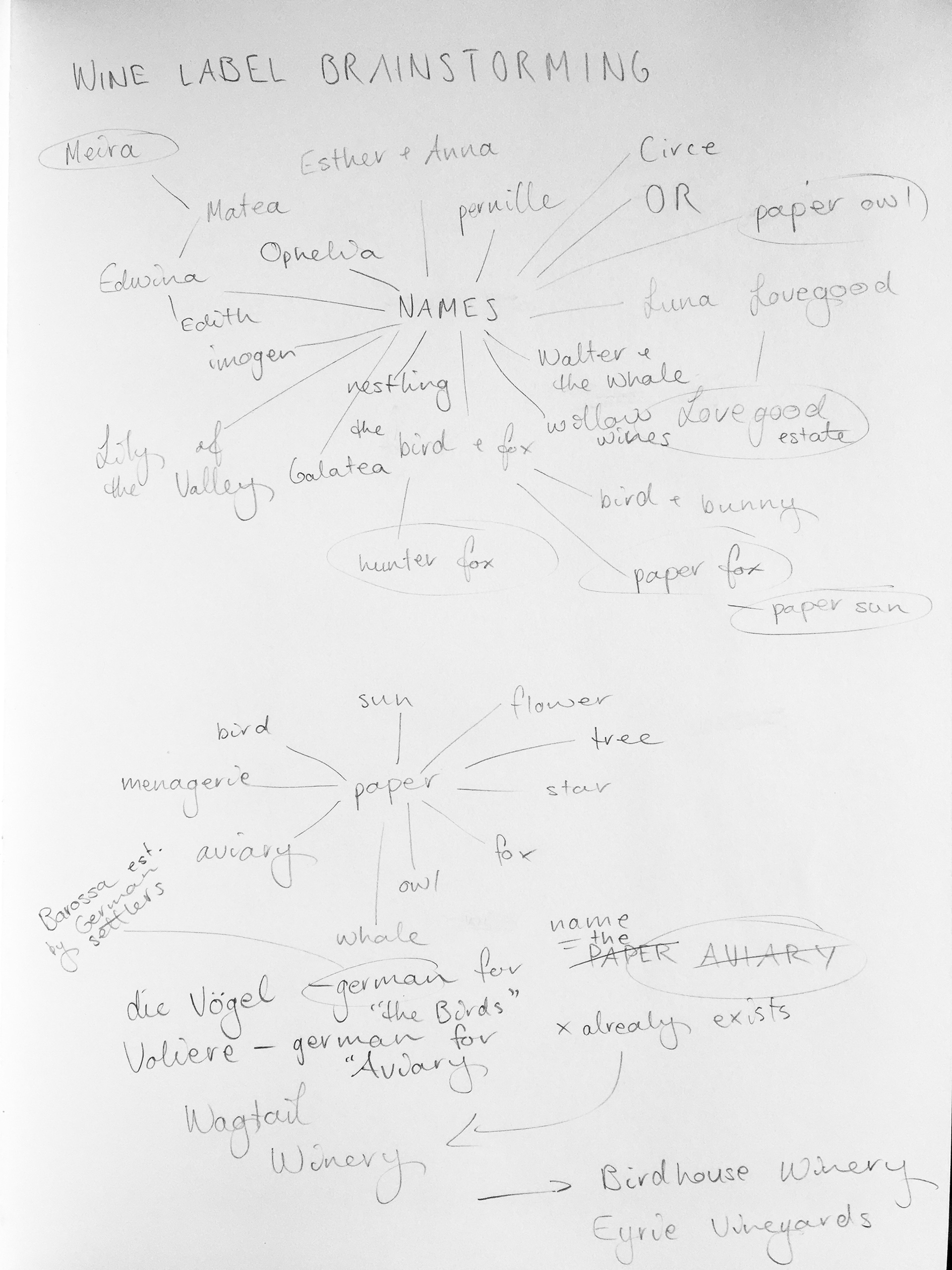
mind mapping names
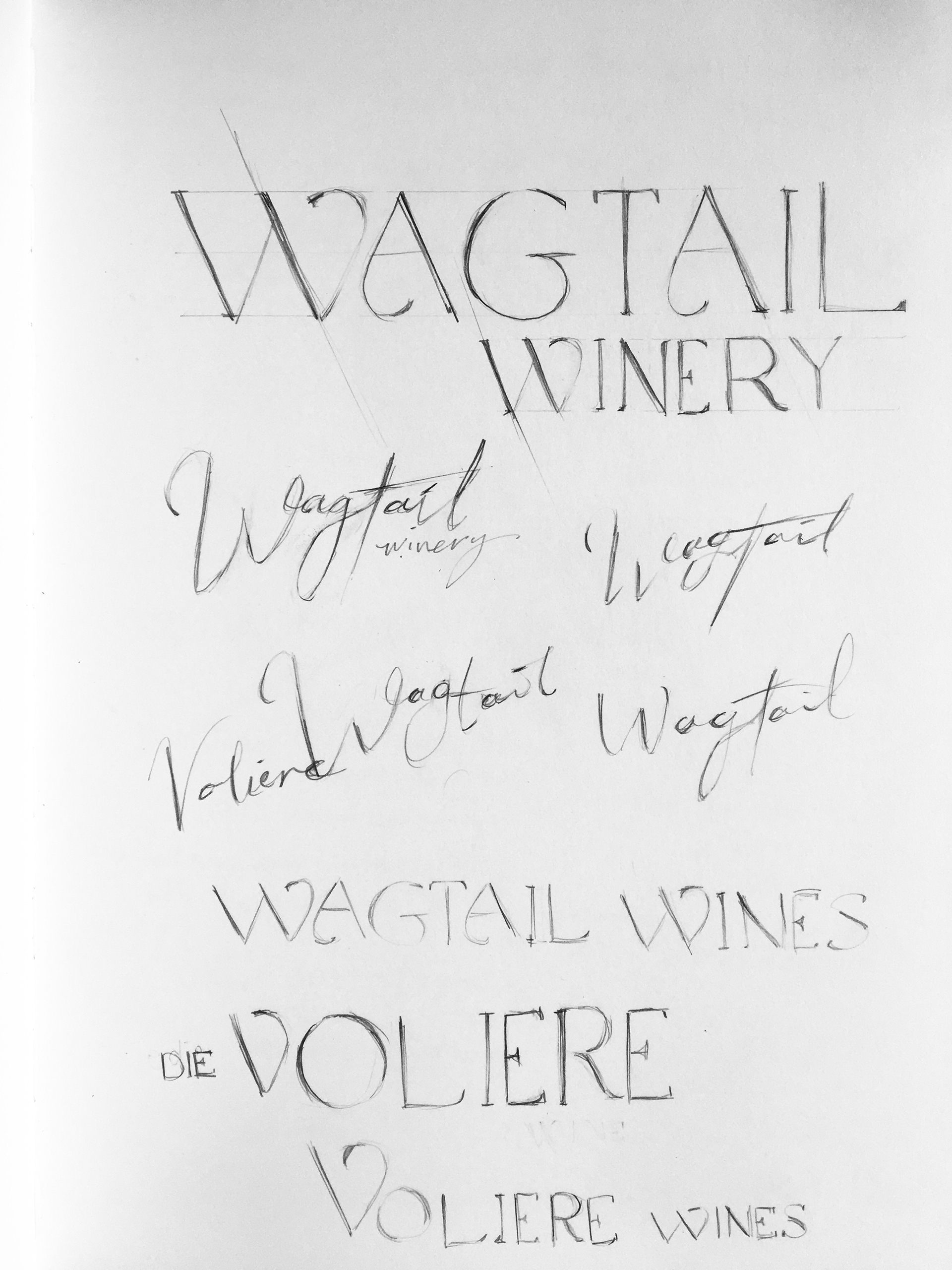
hand-drawn logotype designs
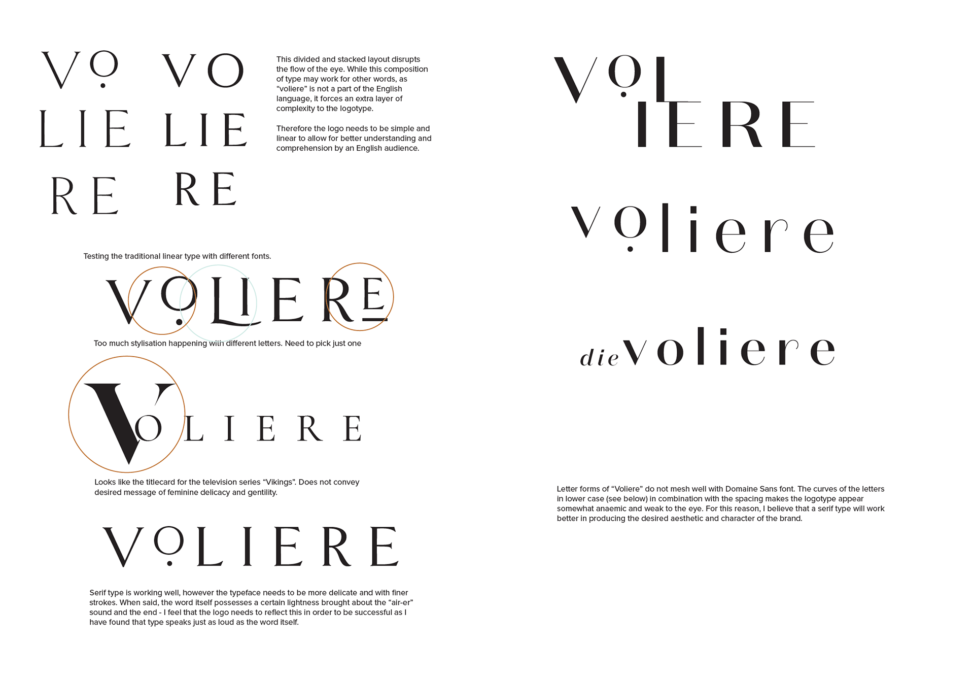
preliminary development
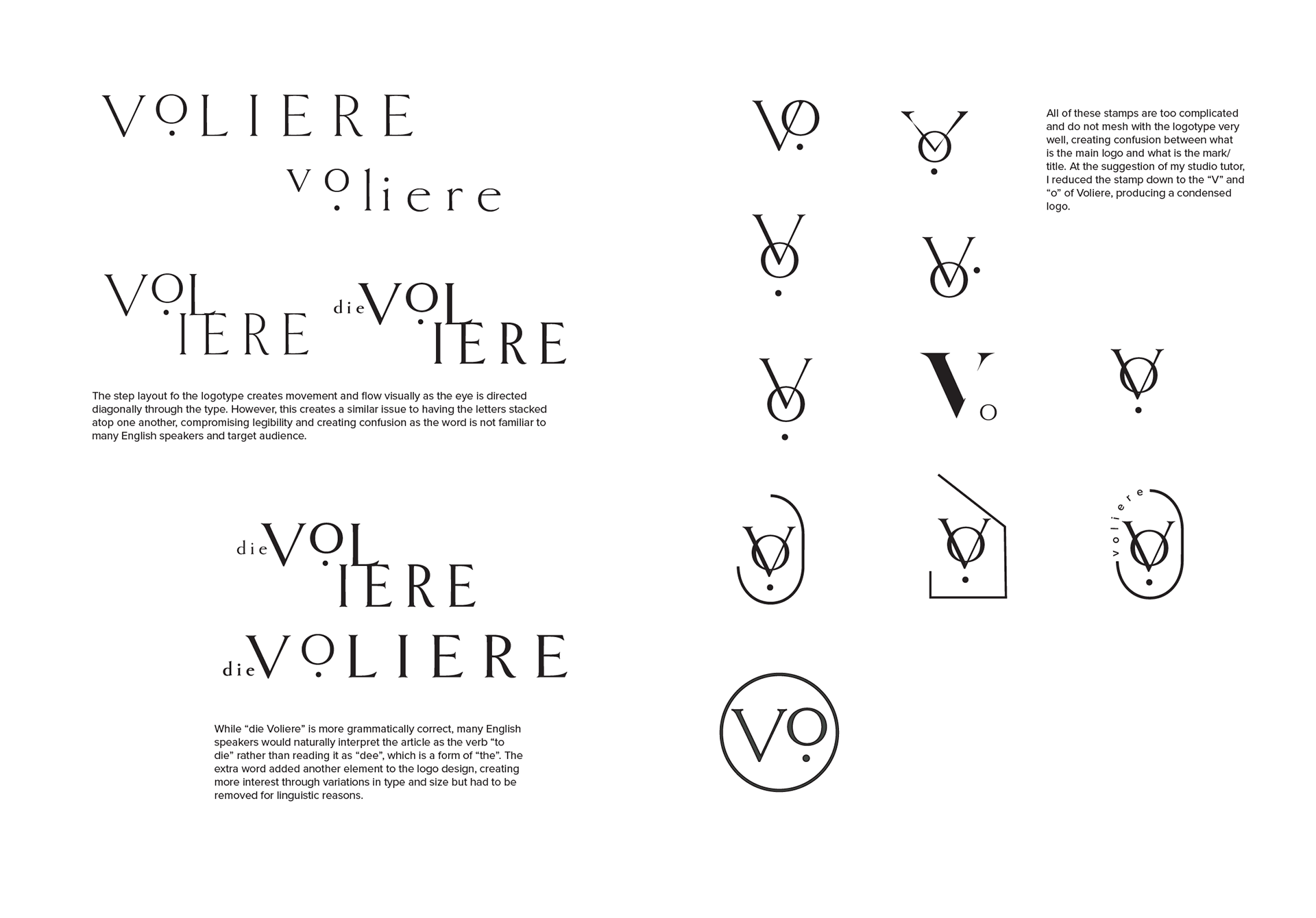
development of final logotype and adapting it to stamp design
The Voliere wine label was characterised by the pictorial aspects of the identity. Much of the development involved putting pencil to paper to create a crafted quality to portray the brand's values, of quality and heritage. This influenced the design of the logotype as it had to be something classic yet contemporary while also not interfering with the illustrations. One had to complement the other so I designed the logo alongside the illustrations to ensure that one would never be isolated from the other to create a strong identity.
The Whale Nursery Project - A Snapshot
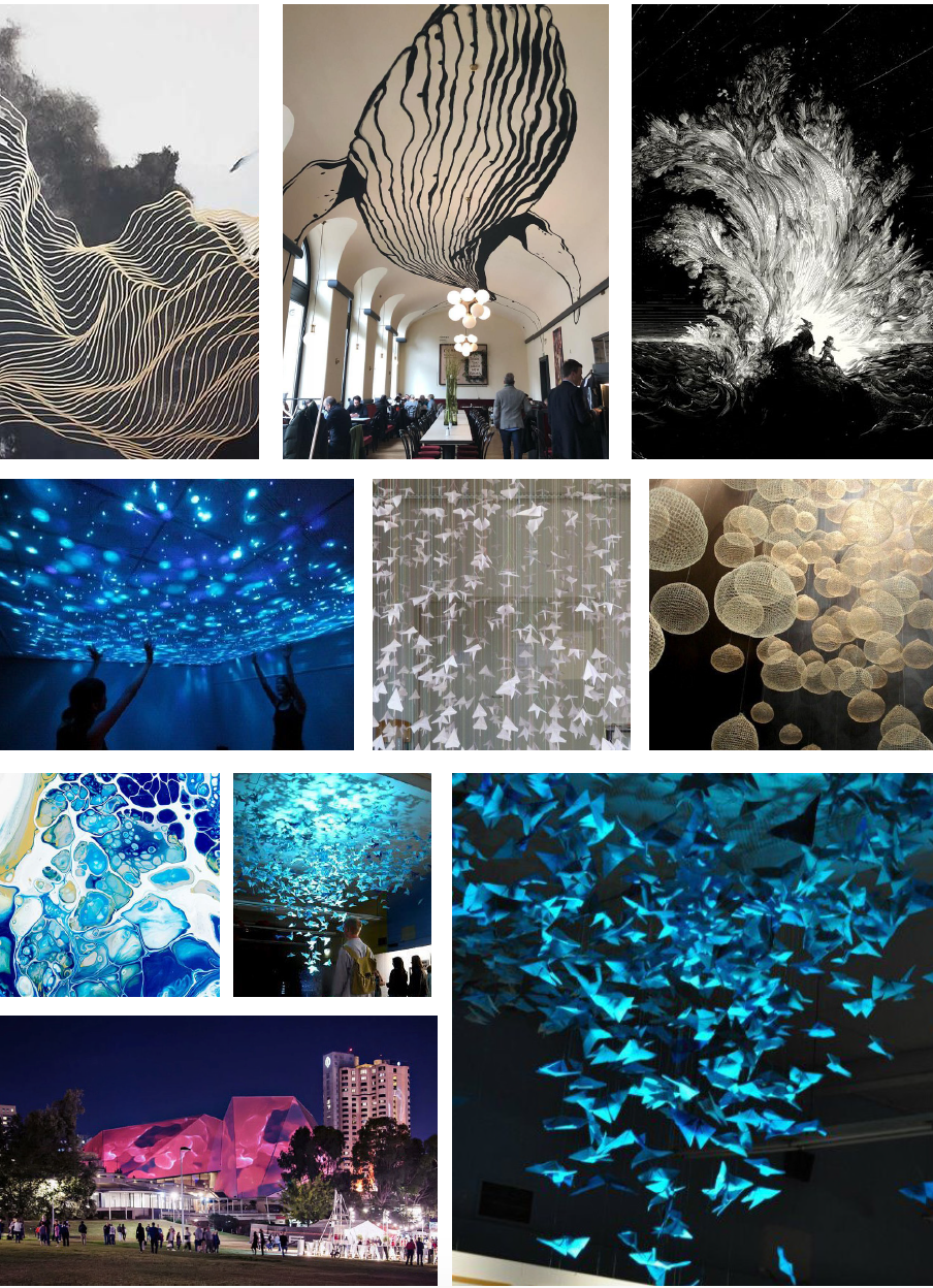
Moodboard - collecting inspiration from a range of sources and research
Concept Pitch
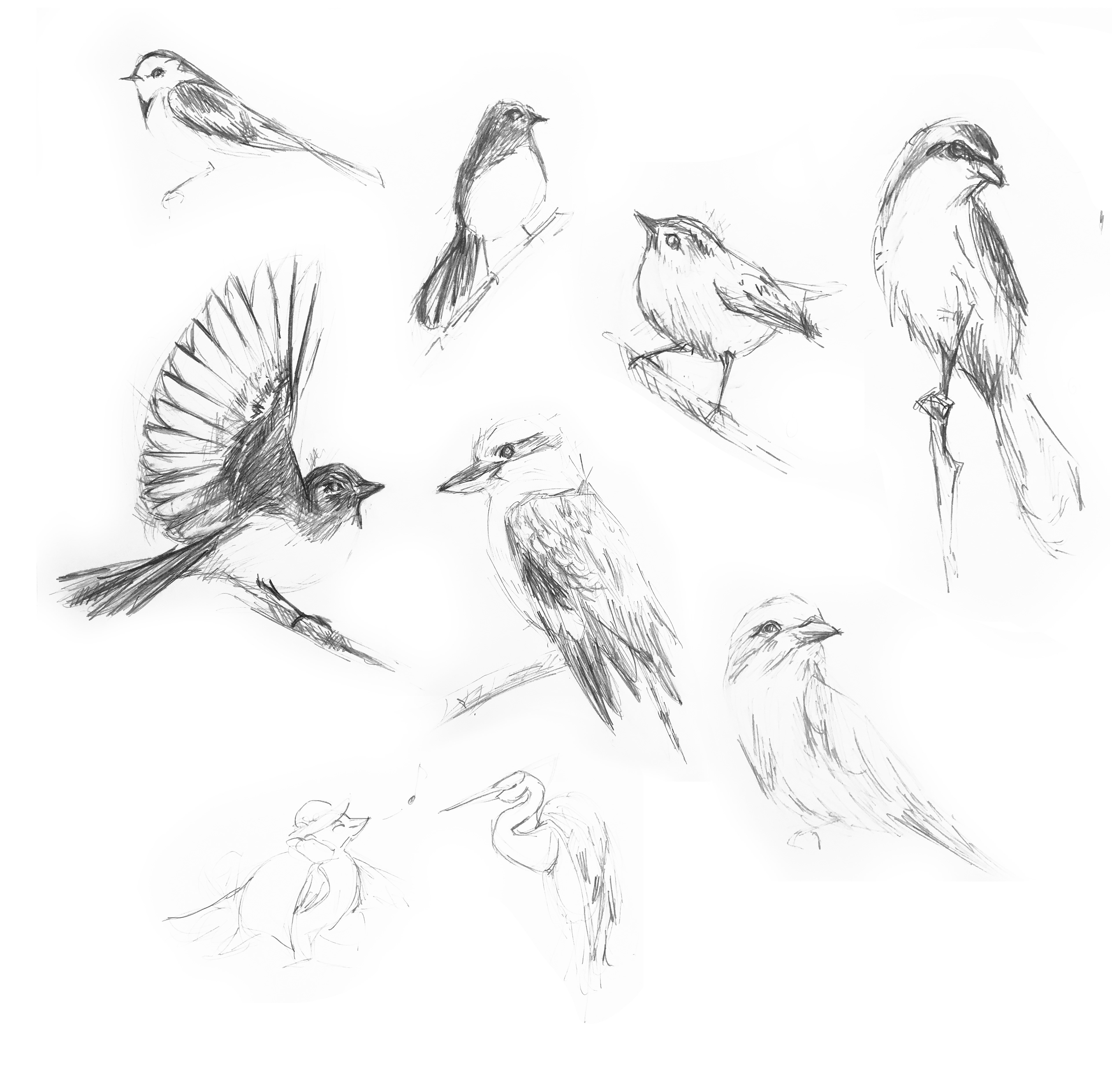
Developing Imagery
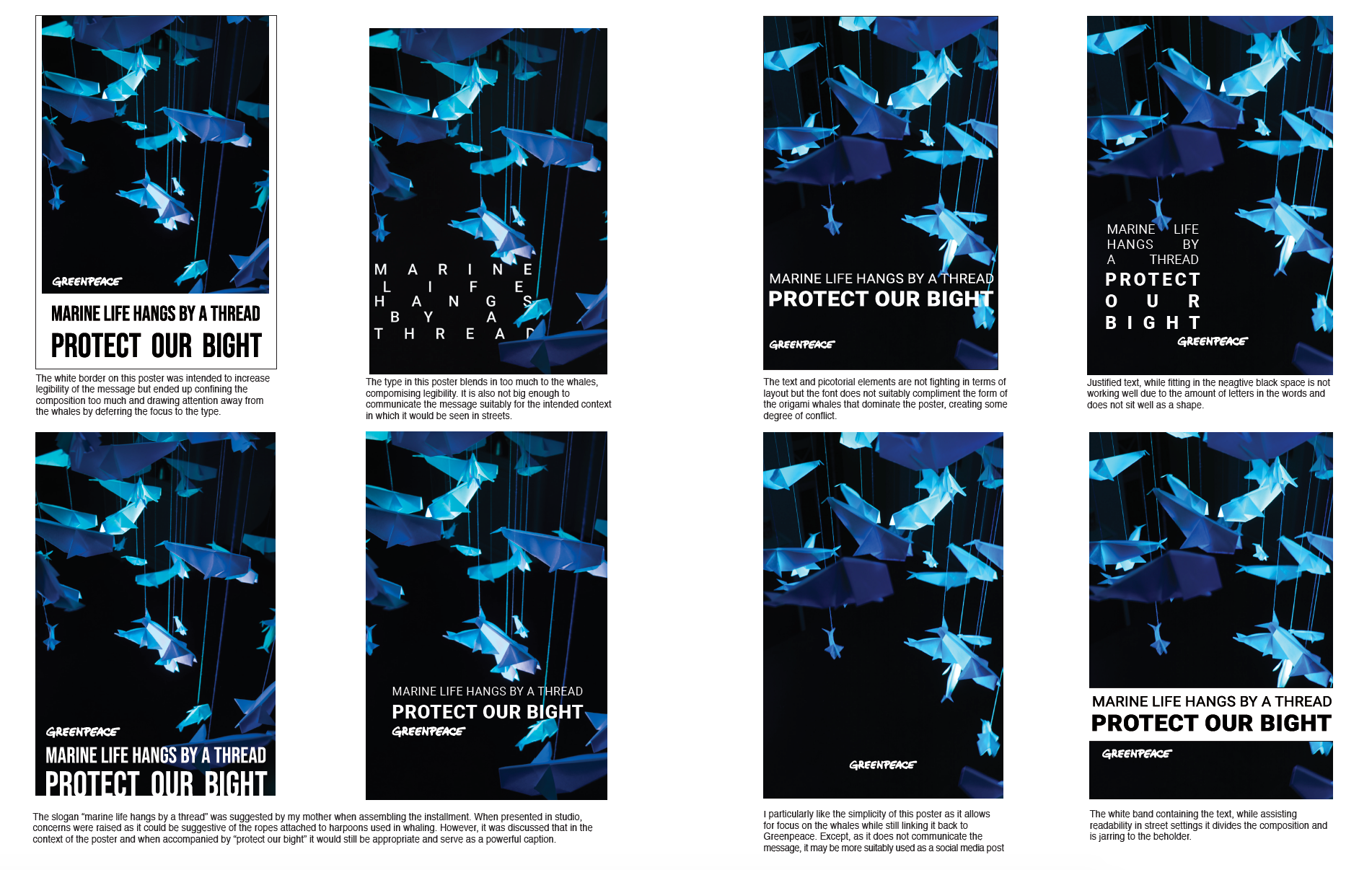
Poster Development 1
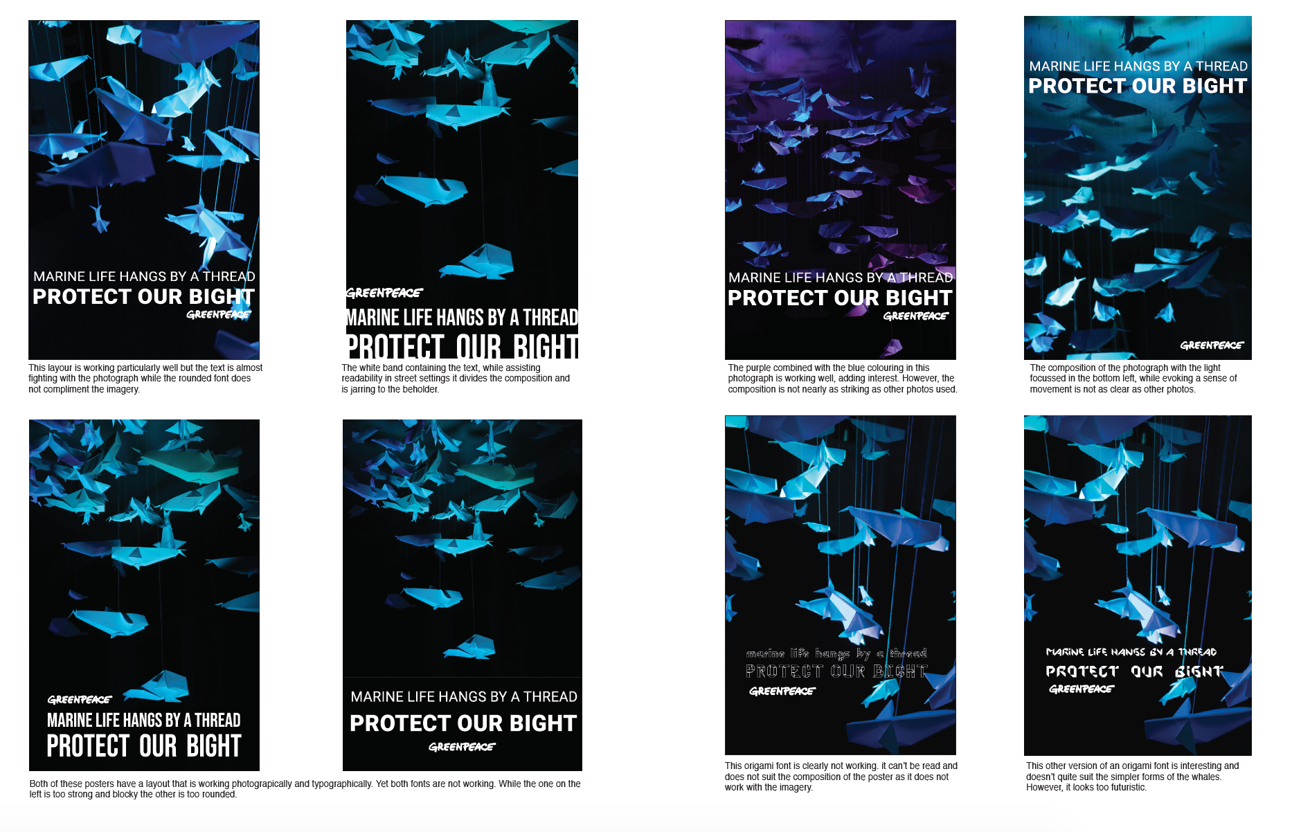
Poster Development 2
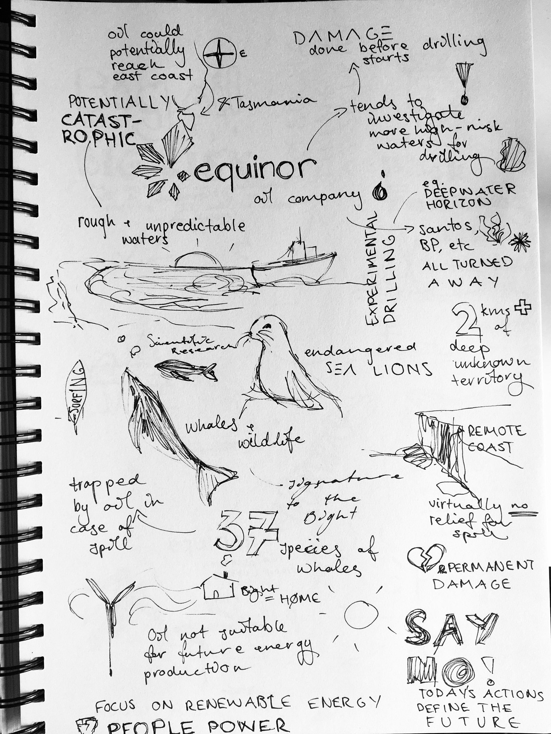
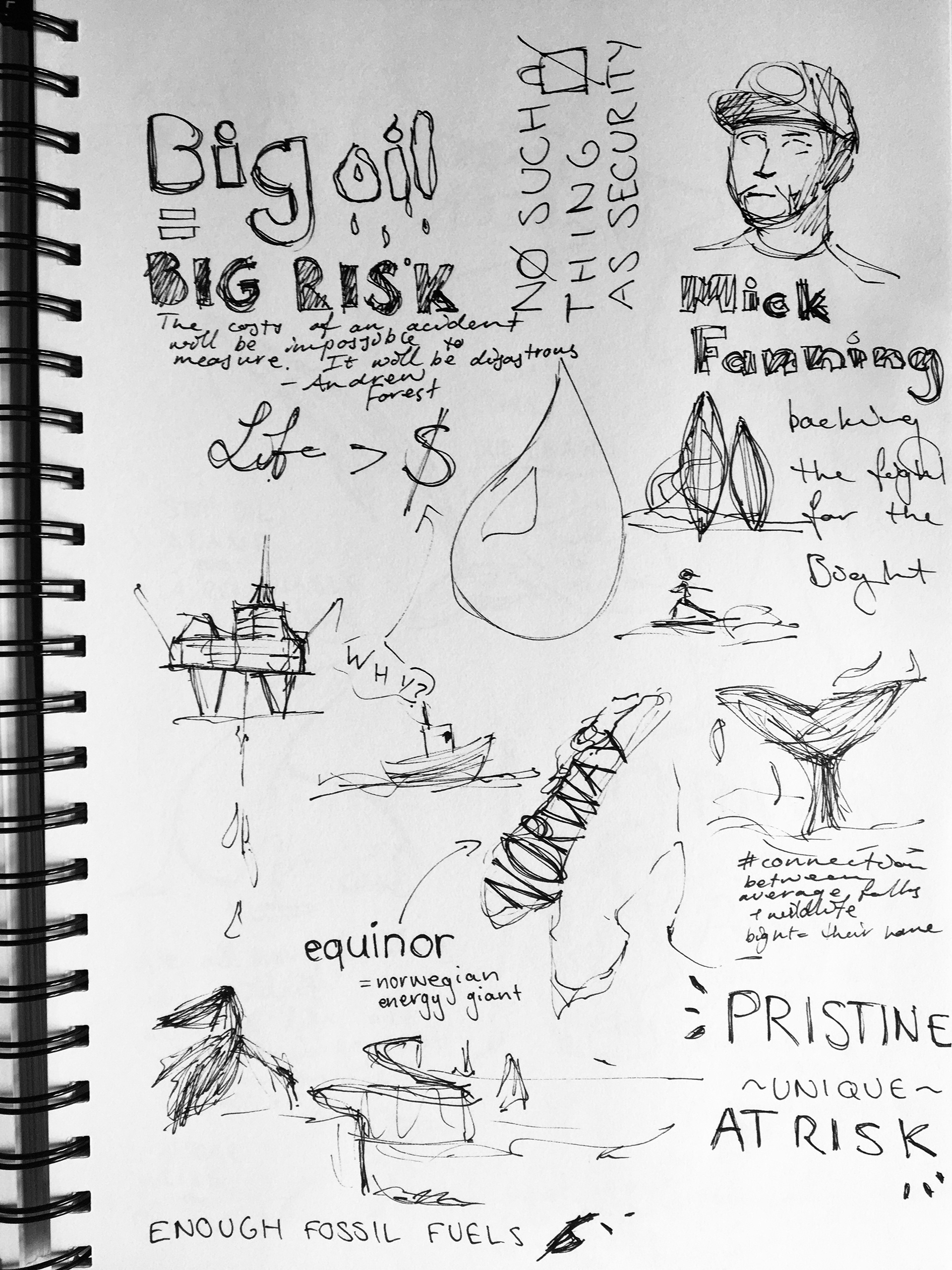
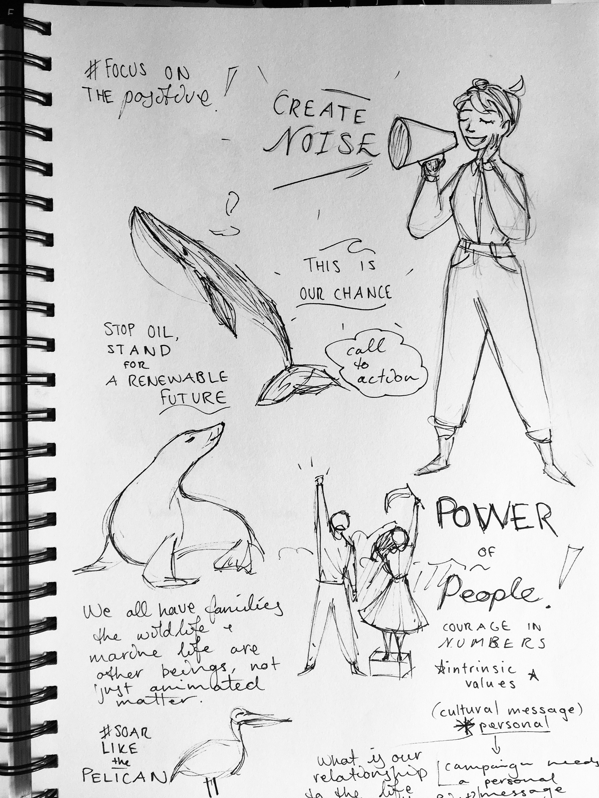
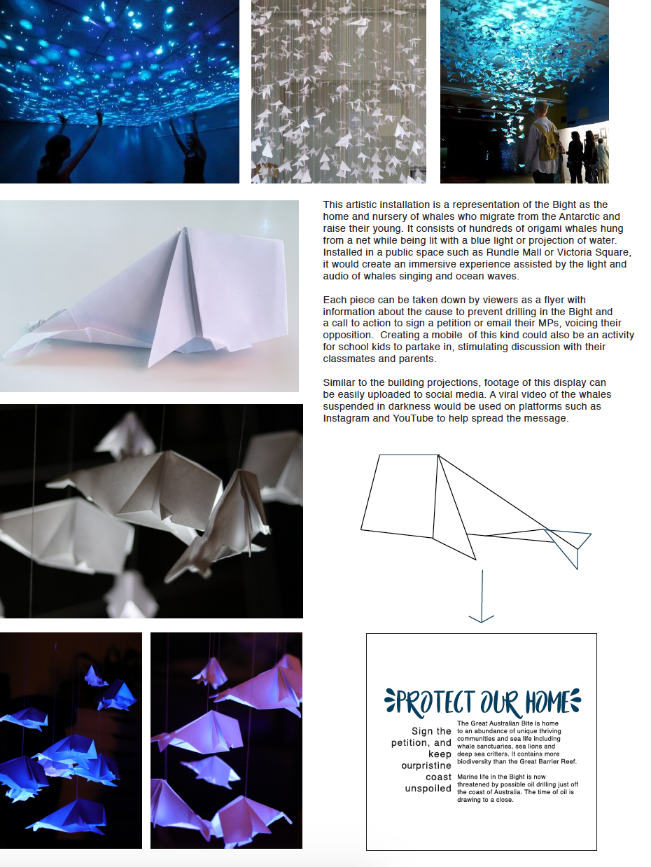
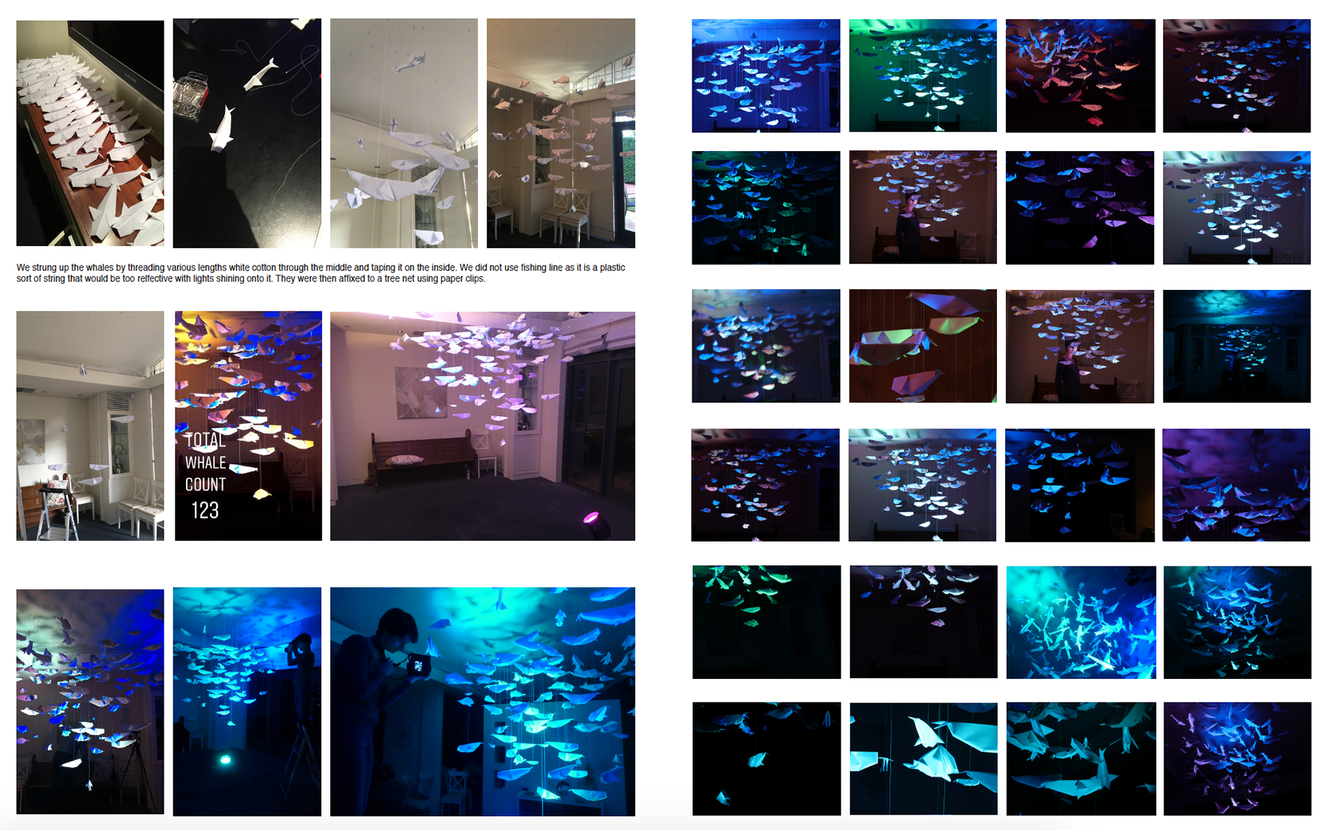
Before embarking on the project, I interrogated the topic and situation surrounding drilling in the bight as I wanted to understand the background as well as I could before creating anything in relation to it. Visual notation helped me do this as I could visualise the influencing factors and what was at stake. After completing the research aspect, I sought a way to raise awareness through creating an experience for the target audience to remember and evoke an emotional connection. After discovering origami art features, I considered how it could be applied to this topic. Since I understood that the Bight was a nursery for young whales, I flipped the idea around and created a large "whale mobile", which would simultaneously represent the bight itself. It became a powerful metaphor, representing something much greater. Having completed the instalment (with the help of my family) I worked to convert the material it into a campaign design that would successfully communicate the desired message and raise awareness.
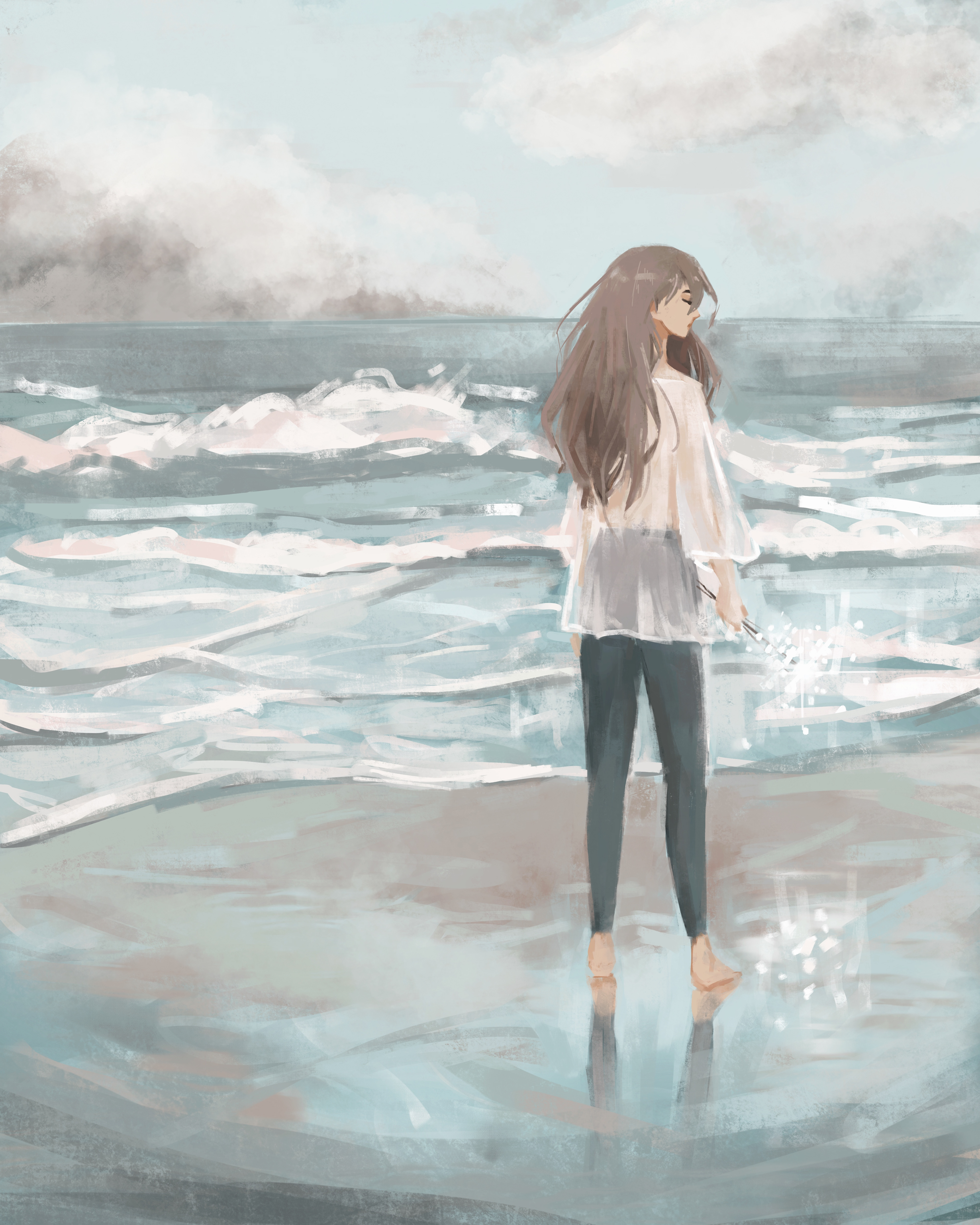
Digital Painting Timelapse